Page header image
April 5, 2021: PowerPoint accessibility - Formatting basics
Accessibility Goal of the Week
This week we continue our multi-part series on PowerPoint accessibility by focusing on general formatting basics. These simple considerations can go a long way to improving the usability of your presentations.
Layout of content
- Use built-in slide layouts to format and organize reading order (more on this in next week's goal).
- Include no more than seven points per slide.
Font type
- Use at least 24-point font size or above.
- Slides with only one, or only a few font faces are usually easier to read. Using too many font faces can create a confusing visual layout which is bad for all users, but may be especially difficult for users with reading disorders, learning disabilities, or attention deficit disorders.
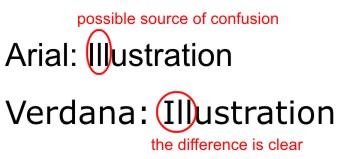
- Sans serif fonts are generally recommended for enhanced readability. When in doubt, use Verdana. It has a simple, straightforward design, and the characters are not easily confused. For example, the upper-case "I" and the lower-case "L" have unique shapes, unlike Arial, in which the two characters may be easily confused (see example below).
Text color
- Some users have difficulty perceiving certain colors. Therefore, do not rely on color alone to bring out text in a document.
- Underline or bold text that you wish to emphasize, or use a textual cue that something is important so those using screen-readers are alerted.
Contrast
- Use a high contrast between text and background colors (dark text on light backgrounds and light text on dark backgrounds).
- How to check suspicious color contrast will be covered in a future Goal of the Week.