Page header image
Module 3, Lesson 7: Color Contrast (PC)
If you use a Mac, click this link to go to the PowerPoint 2016 for Mac module.
What is color contrast?
Perceiving color contrast refers to the ability to distinguish between two colors
which appear next to each other. Colors which appear directly opposite each other
on the color wheel have the highest degree of contrast. For example, purple has a
high contrast with yellow, and blue has a high contrast with orange (see the color
wheel below). Conversely, colors which appear next to or near each other on the color
wheel have a lower degree of contrast. 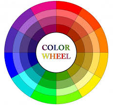
Why is it necessary to check color contrast?
Some students with visual impairments or color deficiencies may have a harder time distinguishing between colors that have a lower degree of contrast. Federal regulations mandate that sufficient color contrast be employed in online content, with a contrast ratio of at least 4.5:1 for normal text and 3:1 for large text (large text being defined as 14 point and bold or larger, or 18 point or larger).
How do I check color contrast?
There are free tools online that easily allow you to check for sufficient color contrast. Some require downloading software, which may pose a problem if you do not have administrator rights on your computer. For this tutorial, we will show a workflow to check contrast without the need to download any extra programs.
-
Find the RGB (Red, Green, Blue) numbers for your foreground and background colors.
- Navigate to a PowerPoint slide which has colors you wish to check.
- Click on an element in the slide (i.e. words or an image). You should see the "Format" tab appear in the ribbon.
- Click on the "Shape Fill" drop-down arrow, and then "Eyedropper".
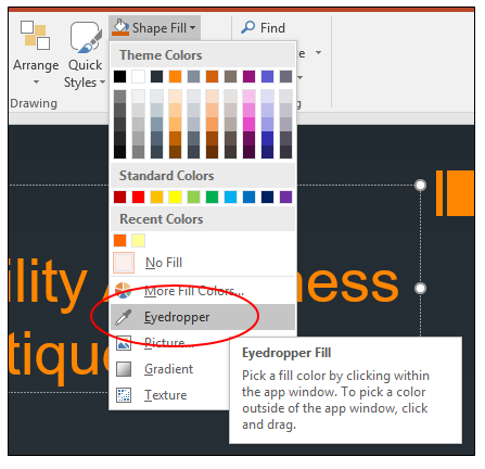
- Your cursor will now resemble an eyedropper. Hover the eyedropper over the foreground color (i.e. the color of the text). You will
see a box with the color appear as well as the RGB numbers for that specific color.
Make a note of these three numbers. You will need them in a moment.
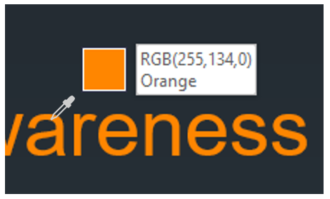
- Hover the eyedropper over the background color and make a note of those RGB numbers.
-
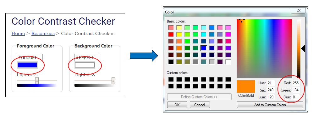
Use the WebAIM Color Contrast Checker
- Online, go to webaim.org/resources/contrastchecker/. WebAIM is a non-profit organization based at the Center for Persons with Disabilities
at Utah State University. It is an excellent resource for online content authors.
The contrast checker tool is a free resource offered through WebAIM.
- The checker has two areas; one for foreground color, and one for background color.
To enter in the RGB numbers, click on the colored box in each area. Another window
will appear in which you can enter in each of the three RGB numbers (see image below
for reference).
- Click OK, and the checker will compare your contrasts and give you a sort of "pass
report". Reading the pass report can be a tad confusing, so here we will examine
the key areas and what to look for to know if your contrasts passed.
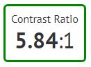
- The "Contrast Ratio" number we are aiming for is at least 4.5:1 for normal text, or 3:1 for large text (large text being defined as 14 point
and bold or larger, or 18 point or larger). In the sample contrast ratio below, we can
see that our two colors have passed.
- The pass report will also show you how your contrast fared for normal text and large
text. In this area we are aiming for a pass in WCAG AA for both normal and large. Do not worry if your contrast fails WCAG AAA. The minimum
standard required under law is conformance with the AA rating. WCAG stands for Web
Content Accessibility Guidelines, which is an international standard recognized by
the federal government.
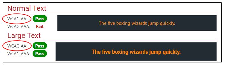
- If your contrasts fail WCAG AA for either the normal or large text, consider changing one or both of your colors to provide a sharper contrast. Run the checker again to make sure it passes level AA.
- The "Contrast Ratio" number we are aiming for is at least 4.5:1 for normal text, or 3:1 for large text (large text being defined as 14 point
and bold or larger, or 18 point or larger). In the sample contrast ratio below, we can
see that our two colors have passed.
- Online, go to webaim.org/resources/contrastchecker/. WebAIM is a non-profit organization based at the Center for Persons with Disabilities
at Utah State University. It is an excellent resource for online content authors.
The contrast checker tool is a free resource offered through WebAIM.
Congratulations!
You have now completed Module 3: Accessible PowerPoint 2016 Presentations for Windows
(PC)